The language of visual communication includes the use of colour. This section introduces complimentary and harmonious colours, cool and warm colours and the meaning different colours bring. Understanding and using colours is one way of enhancing your poetry film.
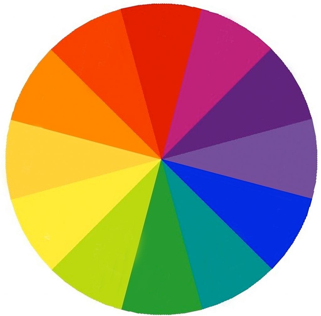
The colour wheel is often used by artists and designers to understand the relationship between colours.
- Complementary colours are directly opposite each other on the colour wheel but have a strong visual impact when placed alongside another.
RED + GREEN
BLUE + ORANGE
YELLOW + PURPLE - Harmonious colours rest alongside each other in the colour wheel.
YELLOW + ORANGE
BLUE + PURPLE
Cool colours
Are based on blue undertones and bring a calming effect. These colours range from cold icy blues to warm Mediterranean turquoises. Blues lower heart rate. Blue and greens are used in advertising medicines and health care products.
Warm colours
Are based on yellow undertones and tend to convey emotions ranging from happiness to violence. Red instantly attracts, makes people excited and increases the heart rate.
Colour examples
Red
• Anger • Love • Stimulation • Purpose • Power • Passion • Danger
Purple
• Royal • Priestly • Reflective • Cruelty • Honour • Transformation
Blue
• Loyalty • Clarity • Innocence • Freedom • Sadness • Trust • Truth
Green
• Life • Nature • Growth • Nurture • Jealousy • Healing
Yellow
• Sunlight • Warmth • Cowardice • Intelligence • Joy • Dishonesty • Imagination • Decay and disease
Orange
• Alert • Sharp • Combative • Enthusiasm • Balance • Demanding attention
Brown
• Earthy • Solid • Dependable • Grounded • Endurance • Home • Security
White
• Purity • Innocence • Goodness • Emptiness • Void • Death and mourning • Precision
Grey
• Lifeless • Doomed • Inflexible • Self-denial • Formal
Black
• Death and mourning • Mysterious • Anonymity • Power